Tuesday, 7 March 2017

Audience feedback

Once our music video was complete and had been exported and uploaded onto YouTube we needed to get some feedback. For this we asked some students to watch our footage over, some of which were the same students who had given feedback for our rough cut. This was a good thing as it meant we could get some direct feedback on the changes that had been made and what effect they had on the music video overall, instead of just an overview of what they thought of our music video. 


We received some very positive feedback in direct response to how our final music video differs from the rough cut. The students thought that the decision to re-film the shots of Shelby singing against the black background and replace them with shots of Shelby against a white background and a shot using a dolly to track Shelby down a corridor were really effective changes as they were a much better fit with the overall theme of the music video than the black background shots had been. Also the students commented that due to our increased experience with filming a music video and our now familiarity with the song this new footage was of a much better quality than its predecessors.

The students also said that they thought our decision to shorten the escalator shots was an effective decision as it allowed them to look more precise and to the point. This allowed the shot to maximise our audiences attention as in the rough cut these shots had been a little bit to dragged out and had pulled the viewer out of their viewing experience as they grew bored and realised that the cuts weren't as clean as they could have been. 

Our audience also really like our use of effects on premiere pro, they thought that the transitions used were the right choice for each shot. They also commented on the fact that our ability to know where the effects should go and our ability to not over use them meant that it looked much more professional as it is often a very amateurish mistake to over use effects in order to make the video look better. 

We also received a small amount of negative feedback from our audience, one of the things that they said took them out of the viewing experience was the fact that some  the lipsyncing was out of sync this made the footage look a little mess. However due to our short shooting schedule we were unable to go back and refilm all of it. We believe this mistake came as a result of the fact that Shelby mispronounced some of the words. This happened for two reasons, firstly her lack of familiarity with the song lyrics at the beginning of the filming process and secondly the artist singing was American and Shelby is English and because of this there are subtle differences in the ways that we pronounce certain word as such the mouth movements to produce the sounds are different. Because of this we always knew that we wouldn't be able to achieve total accuracy when it came to the lip syncing.

Monday, 6 March 2017

Constructing the Digipak

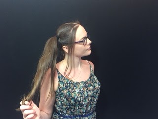
Firstly we had to take some pictures to use for our digipak. We took a variety of different types of pictures so that we had quite a few options when it came to putting together our final digipak.  These are a selection of some of the best pictures that we took, we took a lot more but I wouldn't have the space to display all of them. Here are some of the original images before I manipulated them in photoshop:


After I had all of my images together and selected some of the ones I thought I was going to use and opened them in Photoshop. I then set out making small changes and putting the pictures into different orders over the top of a digipak template, and rearranged them to see what fit the best.


I started to manipulate a few images by overlaying layers and changing the opacity on the top layer but found that what I was doing didn't fit with the theme of the song and as a whole and didn't look the highest quality, these images were later discarded when I had created better images, here is an example of one of the images that was discarded: 


After a few tries I knew which pictures I wanted to use in the final digipak here are the original images before the were manipulated: 


At this stage I began to manipulate the individual images. I took some of the stages and applied them to all of the images, the standard stages started with me cropping them to fit the dimensions of a digipak panel, removing the background as we had decided to use a plain white background so that all of the images matched. 

I used the crop tool in order to size the images to the right dimensions.


I then used the quick selection tool to select the background so that I could remove it from the subject in the foreground. Once the whole background was selected I used the eraser tool to erase the background and then inserted a white background so that all of the images matched.


I then had to crop the images down again to the right size on the white background so that they would fit the dimensions of the panel of a digipak. 

Once all of the images were the same size and all had a matching white background I started my process of creating the colourful overlay images that we planned to use for our two inside panels and back panel. 


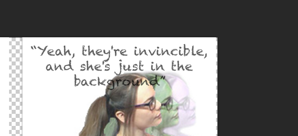
This started with me again using the quick selection tool to to select the subject in the foreground. and copied the layer three times moving each over a little at a time. In the side bar I selected the opacity and turned it down more and more for each layer with the layer on top being the most opaque. I then used the hue and saturation mask tool in the sidebar and changed the hue for the bottom two layers, in this image the back layer was changed to have a purple hue, the second layer was changed to have a green hue and the top layer was kept normal. 

For the other image the same steps were taken. Although with this image we wanted to go for a different colour scheme we thought more of a red tone although we were unsure which so I experimented with some different colour schemes to see which looked the best. Here are four examples of colour schemes that we were looking at: 


We sat for a while and looked all of them over to see which we liked most it took some time and some detailed discussion over the four images as we compared the positives and negatives of each of the colour schemes. 


In the end we chose the red pink toned one that was at lower opacities in the back two layers. We chose this one as it was more of a red tone but wasn't too over powering, it also fit better with the other already edited image in the same style. Here is the chosen image:


For the third overlay image, the one for the back panel we wanted to take the two previously edited overlay images and put them back to back to show the transformation from un popular to popular and also to show that even though her appearance changed she was still the same person. For this image I had to adjust the sizing a little for each of the two images and I also had to use the quick selection tool again to select a section of Shelby's shoulder in the red image to remove it as it was overpowering the back image of the green and purple image. 

Here is the final combined back panel image: 

At this stage I could begin placing the images into the digipak template and start adding the final touches. The first thing that I did once all of the images were in place was to start adding the text. We decided for the inside panel's we were going include quotes of lyrics from the songs. I chose the same font that I had used for the advert title. When placing the text due to the overlay faded effect of the image I thought it would look best if I dropped the opacity a little do that the text fit with the image in the background. Here is me adding some of the text and manipulating the opacity:


This is what my digipak was beginning to look like it gave me a rough idea as to what my finished digipak was going to look like.


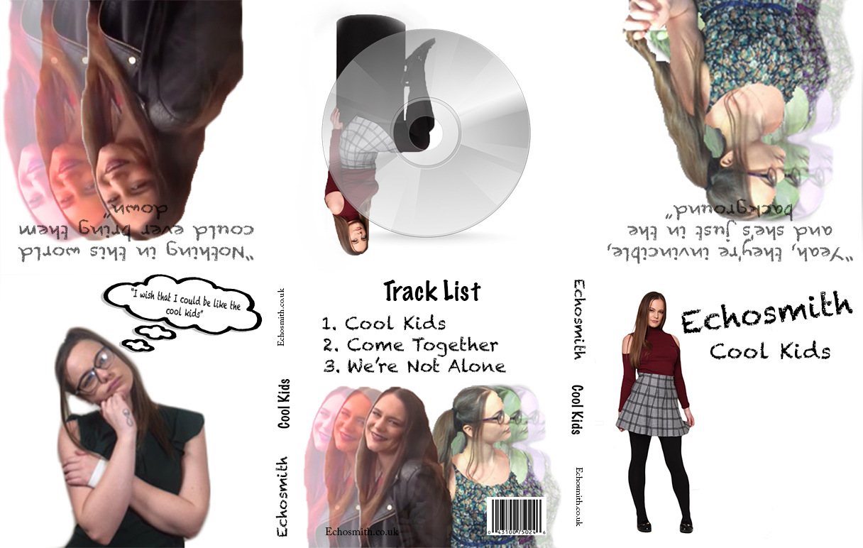
Once all of the text was added I had to go about flipping the pictures in the top row because due to the way that a digipak is made it is folded over so the images must appear upside down while being produced. 


However flipping the images upside down also meant I had to flip the text. 

This is my final digipak:


Thursday, 2 March 2017

Constructing the Advert

Here is the original image that I started with when making the advert for the music video. It is just a picture of Shelby sitting on a platform. We picked this picture because we thought it sort of linked the idea of the popular Shelby and the unpopular Shelby she is wearing a checked skirt that links to her being a school student and being unpopular. She is also wearing a red/ burgundy shirt which uses the colour to link to her transformation to a popular kid.  


I started by opening it in photoshop, before which I had looked up the dimensions of an A5 page which was 148 x 210 mm so I cropped the picture down to fit these dimensions. So we will be producing an A5 sized advert.


After the image was the right size I decided to add the text. I ended up debating over a few different texts and asked some people what they thought worked best. 

Here are the different choices for the font: 


I decided on the first font in the end because the people we asked thought it looked better and also it ft with the theme of the song better as this font resembled writing on a white board which fits with the shots of Shelby writing on a whiteboard in our music video. 


I then started inserting icons such as the Twitter logo, iTunes logo etc. I went online to find files with empty backgrounds and added them as layers on-top of the original background image. I needed to add these logo's to show where the track and the artist could be found. 


I then added some star ratings and newspaper reviews of the song to make it seem like a hit. I found some files online of a black star and inserted it as a layer into the photoshop document and duplicated this layer to make the star ratings. 


Thursday, 23 February 2017

Rough Cut

This is out music video rough cut for Echosmith's "Cool Kids"


Feedback on rough cut:

We asked a group of students in one of the other classes if they wouldn't mind watch our music video rough cur and giving us some feedback. 


The other students feedback allowed for us to know objectively what was going well in our video.  Over all they had a really good opinion on our rough cut although they told us that they preferred the second half of the video as it had better pacing and said that the first half needed some adjustments. They suggested that some of the lip syncing shots at the start of the video weren't of the highest quality due to Shelby not knowing the song as well as she did at the end because of this she made a few noticeable mistakes also for these shots they said that the background didn't really work with the rest of the video. However they really did enjoy the second half and said that the end worked brilliantly. Also in the middle where me and Shelby appear on the escalators needed adjustment as it seemed to be a bit to long which bored the viewer and took them out of the experience a little. 

Because of this feedback we decided that adjustments needed to be made to fix some of the glaring problems we also decided to cut down some of the shots in the first half to fix the pacing issues. As for the lip syncing issues at the start of the video we attempted making adjustments with the colour on premiere pro however the lip syncing really didn't work and the adjustments didn't make much of a difference because of this we decided to re-film some of this footage to get better shots. 

Now we just have to make these changes and add the footage we plan to film next lesson. 

Monday, 20 February 2017

Editing day 2

The second day of editing consisted of us making sure the rough cut was finished so that we could move on to fine tuning the footage. We then used this as the foundation for our final music video, and began to make changes. We took the extra footage that we had filmed because of the feedback and started to insert it into our timeline to replace the old footage that we found unusable. Once everything was in place and we were sure all the footage was how we wanted it we were able to move on to adding transitions and other effects. 

We started by adding a few different transitions testing them out to see which worked best at different points throughout our video. We decided to stick with dissolves and swipes. We then moved on to some colour correction as some of the footage had different exposures which gave the overall video a messy look as it meant that not all of the footage looked like it went together.  After the colour correction all of the footage worked better together as they now all had the same feel to them. 

Once all of these basic elements were out of the way, it was just a case of scrutinising our video to see if we could pick up any little details that we'd missed. This allowed us to make some small tweaks which for us made all of the difference with the way that  footage flowed, and fit in time with the music.  Although after awhile of watching the footage over we had watched it too much and  we were now unable to pick up on any of the problems. Due to this we asked some other students if they would watch the footage over  so that we got an objective opinion that could pick up on any of the things that we had missed. Unbeknown to us there was a section of footage where the lighting could be seen in shot, the other students picked up on this where we had missed it therefore we were able to make some changes by rearranging the footage so that the light that had been in shot was no longer visible.  

Here is a view of the timeline once we finished our edit.


Thursday, 9 February 2017

Editing day one

The first day of editing consisted of us uploading our footage and begining to organise it. We went through the footage and began to put it into folders so that it would be easier to find later in the editing process.  After this was completed we started to piece the best of the footage together to make a rough cut in order to get a rough idea of our final video and also to see if there was any additional footage that would need to be filmed.  When editing our rough cut we layered the footage and cut the shots that we wanted to use. We also got a sense of what needed to go where and the order our footage needed to go in. 


Our first day of editing was fairly successful as we managed to organise and put together quite a lot of our footage and figure out what else needed to be done and if any additional footage was needed. 

Thursday, 2 February 2017

Day two of filming.

For the second day of filming we were focused on getting shots before and after the transformation as such we shot both "unpopular" shots and "popular" shots. This was possible as we planned in advance to have me and Shelby bring two sets of clothes and some make up so that we would be able to change in the public toilets part way through the day. 
 
The first part of the days shots consisted with me and Shelby as "unpopular" kids as we browsed through shops and purchased makeup and clothing items which we would later use in the "make over" segment of our music video. We decided to do the "unpopular" shots first as it was easier to change from "unpopular" to popular than it was to attempt the procedure the other way around. There were shots during this part of the day where our director of photography Louis decided to shoot some candid shots of me and Shelby shopping in a clothing store. This was brilliant as it helped add authenticity to the shots making the footage more natural so it would look better for the audience. 


After this me and Shelby went to get changed and we started shooting the "popular" footage. In this me and Shelby can be seen entering Lakeside and coming down a set of escalators. This scene also contained shots of the conventional "popular" kids that have appeared previously in the video mocking Shelby staring in confusion as they passed us on the escalators. This took a few attempts as it was difficult to organize around the general public and at this point we were working with a larger group of people. But in the end this was successful and pretty fun to film.  

During our second day of filming we attempted to incorporate a variety of different shot types. Although due to us having to be inconspicuous with our filming we were only able to take our camera with us to lakeside because of this our footage at lakeside is all handheld which we feared might compromise the quality of our footage as it may not be completely stable, However after revising the footage this does not appear to be an issue at this time.