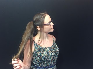
Firstly we had to take some pictures to use for our digipak. We took a variety of different types of pictures so that we had quite a few options when it came to putting together our final digipak. These are a selection of some of the best pictures that we took, we took a lot more but I wouldn't have the space to display all of them. Here are some of the original images before I manipulated them in photoshop:

After I had all of my images together and selected some of the ones I thought I was going to use and opened them in Photoshop. I then set out making small changes and putting the pictures into different orders over the top of a digipak template, and rearranged them to see what fit the best.
I started to manipulate a few images by overlaying layers and changing the opacity on the top layer but found that what I was doing didn't fit with the theme of the song and as a whole and didn't look the highest quality, these images were later discarded when I had created better images, here is an example of one of the images that was discarded:
After a few tries I knew which pictures I wanted to use in the final digipak here are the original images before the were manipulated:
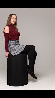
At this stage I began to manipulate the individual images. I took some of the stages and applied them to all of the images, the standard stages started with me cropping them to fit the dimensions of a digipak panel, removing the background as we had decided to use a plain white background so that all of the images matched.
I then used the quick selection tool to select the background so that I could remove it from the subject in the foreground. Once the whole background was selected I used the eraser tool to erase the background and then inserted a white background so that all of the images matched.
I then had to crop the images down again to the right size on the white background so that they would fit the dimensions of the panel of a digipak.
Once all of the images were the same size and all had a matching white background I started my process of creating the colourful overlay images that we planned to use for our two inside panels and back panel.
This started with me again using the quick selection tool to to select the subject in the foreground. and copied the layer three times moving each over a little at a time. In the side bar I selected the opacity and turned it down more and more for each layer with the layer on top being the most opaque. I then used the hue and saturation mask tool in the sidebar and changed the hue for the bottom two layers, in this image the back layer was changed to have a purple hue, the second layer was changed to have a green hue and the top layer was kept normal.
For the other image the same steps were taken. Although with this image we wanted to go for a different colour scheme we thought more of a red tone although we were unsure which so I experimented with some different colour schemes to see which looked the best. Here are four examples of colour schemes that we were looking at:
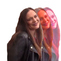
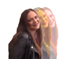
We sat for a while and looked all of them over to see which we liked most it took some time and some detailed discussion over the four images as we compared the positives and negatives of each of the colour schemes.
In the end we chose the red pink toned one that was at lower opacities in the back two layers. We chose this one as it was more of a red tone but wasn't too over powering, it also fit better with the other already edited image in the same style. Here is the chosen image:
For the third overlay image, the one for the back panel we wanted to take the two previously edited overlay images and put them back to back to show the transformation from un popular to popular and also to show that even though her appearance changed she was still the same person. For this image I had to adjust the sizing a little for each of the two images and I also had to use the quick selection tool again to select a section of Shelby's shoulder in the red image to remove it as it was overpowering the back image of the green and purple image.
Here is the final combined back panel image:
At this stage I could begin placing the images into the digipak template and start adding the final touches. The first thing that I did once all of the images were in place was to start adding the text. We decided for the inside panel's we were going include quotes of lyrics from the songs. I chose the same font that I had used for the advert title. When placing the text due to the overlay faded effect of the image I thought it would look best if I dropped the opacity a little do that the text fit with the image in the background. Here is me adding some of the text and manipulating the opacity:
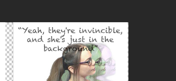
This is what my digipak was beginning to look like it gave me a rough idea as to what my finished digipak was going to look like.
Once all of the text was added I had to go about flipping the pictures in the top row because due to the way that a digipak is made it is folded over so the images must appear upside down while being produced.
However flipping the images upside down also meant I had to flip the text.
This is my final digipak:




No comments:
Post a Comment